 Login
Login
- Released At: 31-10-2024
- Page Views:
- Downloads:
- Table of Contents
- Related Documents
-
Configuration Examples
Software version: E0714
Document version: 5W106-20241025
Copyright © 2024 New H3C Technologies Co., Ltd. All rights reserved.
No part of this manual may be reproduced or transmitted in any form or by any means without prior written consent of New H3C Technologies Co., Ltd.
Except for the trademarks of New H3C Technologies Co., Ltd., any trademarks that may be mentioned in this document are the property of their respective owners.
The information in this document is subject to change without notice.
Product overview
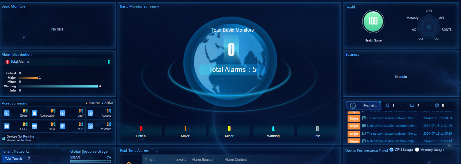
With changes in IT operation and management goals, scope, objects, and depth, service visualization has become one of the key trends in IT operation platform construction. The service application system generates a large amount of data during operation. The data can be used for monitoring services or displaying results. The visualized dashboard is a product designed for displaying custom service data.
This document describes how to customize and display service data by using charts and the orchestration feature through the dashboard.
Usage guidelines
Application scenarios
Users need to visualize their service data.
Prerequisites
· The configuration of the chart data source requires the dashboard designer to be familiar with basic API invocation knowledge and JavaScript language.
· Make sure invoked interface is interoperable with the dashboard network environment.
· By default, only the admin account has permissions to edit the default and area-specific dashboards.
Example: Configuring dashboard
Creating a dashboard
1. Log in to Unified Platform and hover over the logo in the top left corner, as shown in Figure 1.
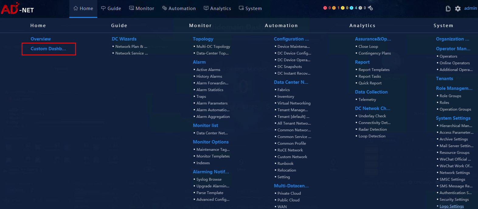
2. Select Home > Custom Dashboard to access the Dashboard Editor page, as shown in Figure 2.
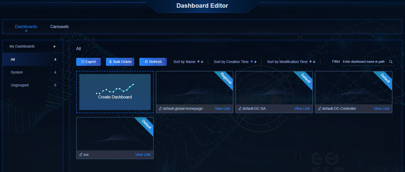
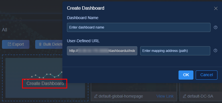
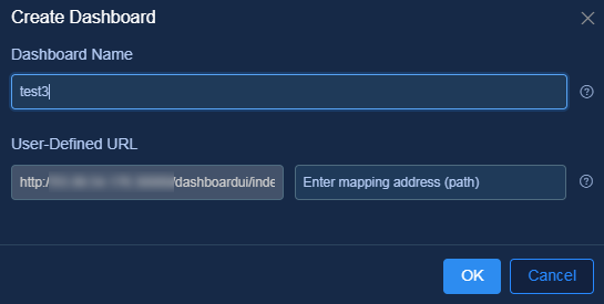
3. On Dashboards > All page, click Create Dashboard to open the window as shown in Figure 3. Configure the following parameters:
¡ Dashboard Name: Required. This example uses test1.
¡ User-Defined URL:
- URL: Optional. Use the default setting. The system generates a mapping address randomly after the dashboard is successfully created.
- Mapping address: Physical address that can be directly addressed. The mapping address of the dashboard is unique. As a best practice to configure a dashboard to be displayed on the homepage of Unified Platform, configure a custom mapping address to facilitate internal navigation.
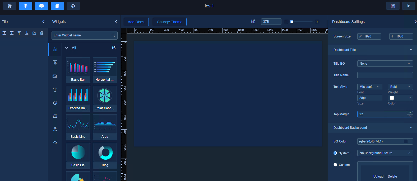
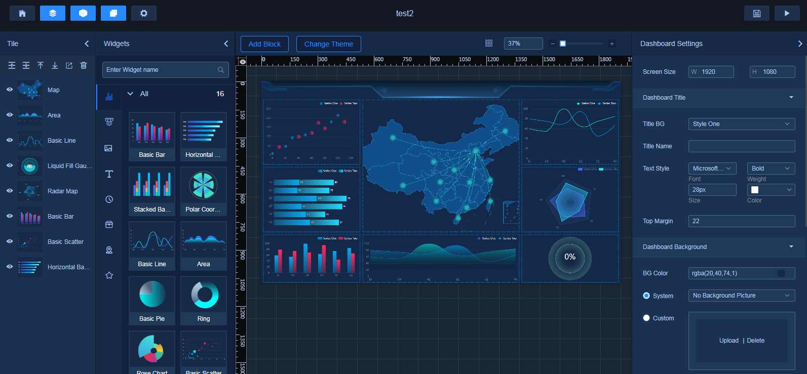
4. Click OK. After you successfully create the dashboard, the system automatically places you to the dashboard settings page, as shown in Figure 4.
Figure 4 Dashboard settings page
Editing a dashboard
Navigate to the dashboard settings page by using the following methods:
· After you create a dashboard, the system automatically places you to the dashboard settings page.
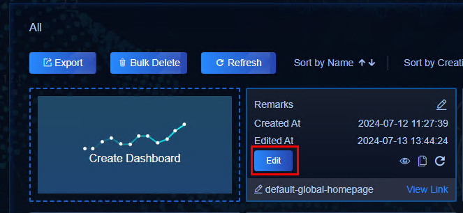
· On the all dashboards page, select an existing dashboard and click Edit, as shown in Figure 5.
Figure 5 Selecting an existing dashboard to edit
The dashboard settings page includes a shortcut toolbar and multiple configuration areas, as shown in Figure 6. Click an icon in the toolbar to quickly open or close the associated panel.
Figure 6 Dashboard setting page
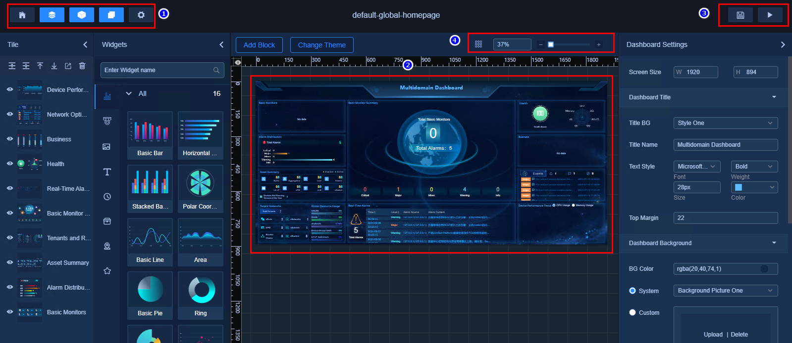
Table 1 Common icons and areas
|
Location |
Icon |
Name |
Description |
Remarks |
|
Top left toolbar |
|
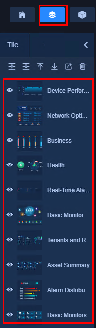
Tile |
Each widget corresponds to a tile. The order of tiles from top to bottom in the tile list indicates the layout of the widgets on the dashboard. You can select the tiles to highlight the associated widgets on the canvas. Auxiliary widgets can achieve better rendering effects on the dashboard through tile configuration. For example, the border effect on a dashboard is created by combining the border widget and service widget. |
|
|
|
Widgets |
Use multiple widgets from the widget list to arrange the canvas. |
|
|
|
|
Page Settings |
Set the overall properties of the current dashboard and the properties of its widgets. Page settings are just part of page configuration. After opening the page configuration panel, click the canvas to switch to the page settings panel. You can click a widget on the canvas to switch to the tile settings panel. The available settings vary by widget. |
|
|
|
|
Global Data Settings |
Set the default values for global variables to dynamically control API request parameters in widgets in path mode. |
|
|
|
|
Dashboard Editor |
Click Dashboard Editor to exit the dashboard settings page. |
N/A |
|
|
Page center |
N/A |
Canvas |
Displays the dashboard being edited. |
|
|
Top right toolbar |
|
Save |
Click Save to save the dashboard settings. |
N/A |
|
|
Preview |
Used for dashboard adjustment by previewing the final display effect. This operation does not affect the saved or released dashboard. |
N/A |
|
|
Top right of the canvas |
|
Zoom tool |
Adjust the preview scale of the canvas by either changing the value in the field or dragging the slider. |
N/A |
|
|
Shortcut key prompt |
Hover over an icon to display the related shortcut key information. |
N/A |
Add Block
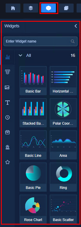
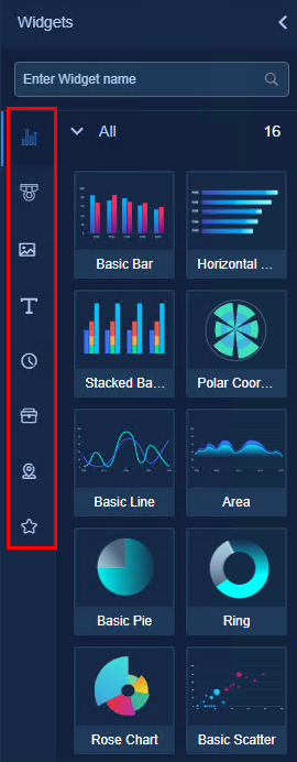
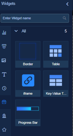
On the dashboard settings page, you can arrange the canvas by using various widgets from the widget list. The widget list panel opens by default on the left of the dashboard settings page. It includes multiple widget types such as chart & table, service, picture, text, time, auxiliary, and map widgets, as well as the favorite widgets feature.
1. Click the Widgets icon  to
open the widget list.
to
open the widget list.
2. Click the tabs on the left of the widget list to switch between different types of widgets, as shown in Figure 7.
Figure 7 Select different types of widgets
3. Click or drag a widget onto the canvas to add it.
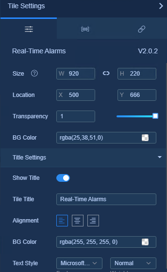
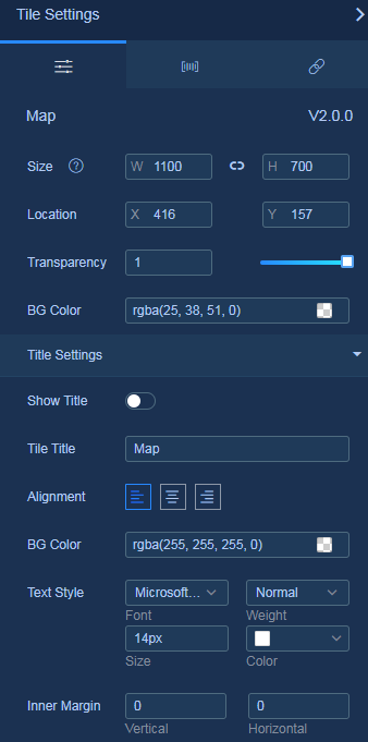
Tile settings
Style settings
You can navigate to the Page Settings > Tile Settings page to edit style settings, including basic and custom style settings.
· Basic style settings apply to all widgets, which include size, location, transparency, background, title, title display, title alignment, title background color, title font, title weight, title size, title color, and inner margin.
· Custom style settings uniquely apply to each widget, allowing you to fine-tune the style settings for the widget.
To configure style settings:
1. Click the Page Settings icon  to
open the page settings panel.
to
open the page settings panel.
2. Click a widget on the canvas to switch to the tile settings panel, as shown in Figure 8.
Figure 8 Tile settings - style settings

Data settings
Widgets support configuring static data and API data as their data source. Static data is in JSON format.
Static data
1. Click the Page Settings icon  to
open the page settings panel.
to
open the page settings panel.
2. Click a widget on the canvas to switch to the tile settings panel, as shown in Figure 9.
Figure 9 Tile settings - style settings
3. Click the Data icon  to
switch to the data settings panel, as shown in Figure 10.
Different widgets require different configuration data.
to
switch to the data settings panel, as shown in Figure 10.
Different widgets require different configuration data.
Figure 10 Tile settings - data settings
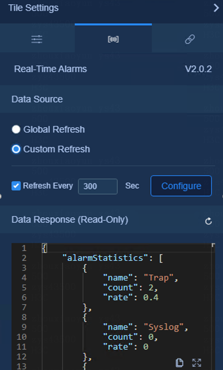
4. Click Configure in the Data Source area to open the data source configuration panel.
5. Select Static for Data Source Type, as shown in Figure 11. Edit the JSON data required by the widget in the input field.
Figure 11 Configuring static data source

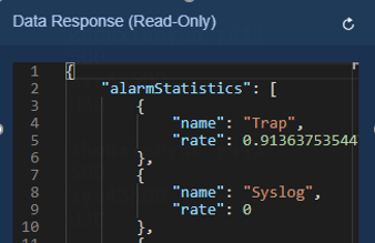
6. View static data in the data response field, as shown in Figure 12.
Figure 12 Data response result
API data
1. Click the Page Settings icon  to
open the page settings panel.
to
open the page settings panel.
2. Click a widget on the canvas to switch to the tile settings panel.
3. Click the Data icon  to
switch to the data settings panel. Different widgets require different
configuration data.
to
switch to the data settings panel. Different widgets require different
configuration data.
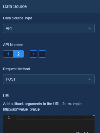
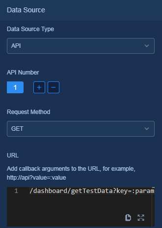
4. Click Configure in the Data Source area to open the data source configuration panel. Select API for Data Source Type, as shown in Figure 13.
5. Click the + or - button under API Number to add or delete API sources. The widgets will invoke the API sources in order and consolidate all returned data into an array. In addition to the map widget, the system supports configuring a maximum of five API data sources.
Figure 13 Configuring API data sources
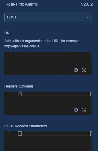
6. Select GET or POST for Request Method.
¡ If you select GET, configure the request URL and headers.
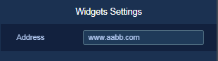
- The format of the URL is http://ip:port/dashboard/getData. If the protocol, IP, port, and the address of the URL are the same as those of the dashboard, you only need to enter the path portion.
¡ If you select POST, you can enter the parameters carried in the Body, as shown in Figure 14.
Figure 14 Configuring API data source - POST method
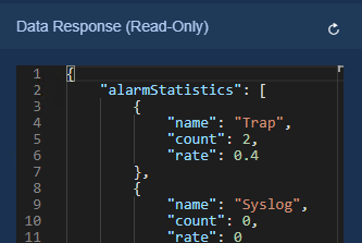
7. View the data returned by the request in the data response field, as shown in Figure 15.
Figure 15 Data response result
Data filter
When rendering data, all widgets must use the static data format, and the data must contain field names that the widgets can resolve. For data sources other than static data, the response result can hardly meet both requirements. This page allows you to enter JavaScript scripting language to parse and filter the response result of the data source into a usable data format. You can also use this feature to further process the data.
Configure data filter in the data configuration of the tile settings. All types of data sources support enabling or disabling data filter. After enabling data filter for the widget, you can configure data filter script code for the widget.
To configure data filter settings:
1. Click the Page Settings icon  to
open the page settings panel.
to
open the page settings panel.
2. Click a widget on the canvas to switch to the tile settings panel.
3. Click the Data icon  to
switch to the data settings panel.
to
switch to the data settings panel.
4. Click Configure in the Data Source area to open the data source configuration panel. Select Static or API for Data Source Type.
5. Select the Data Filter option and then turn on the Enable Filter Debugging option, as shown in Figure 16.
Figure 16 Configuring data filter settings
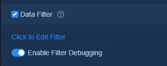
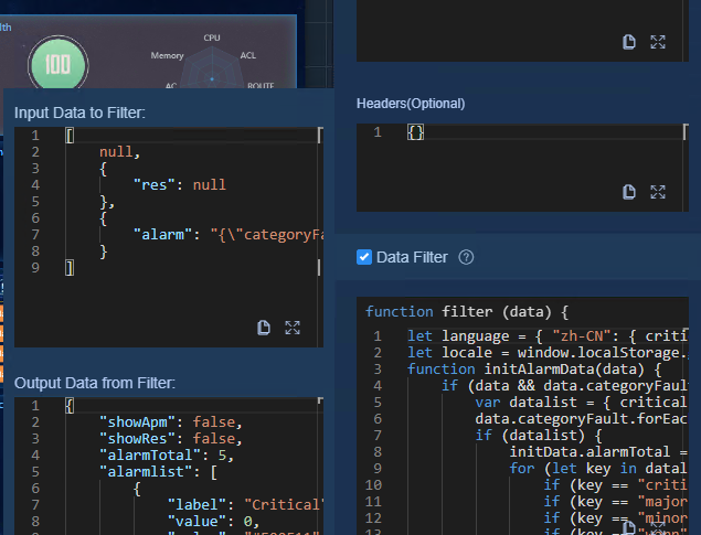
6. Click the Click to Edit Filter link to edit the data filter settings. After editing the data filter settings with the JavaScript scripting language, click Preview to view the data before and after filtering, as shown in Figure 17. The data filter processes the original static data and turns it into an array with only one JSON element.
|
|
NOTE: The filter script is used on the final consolidation result returned from all data sources, so pay attention to the script logic when writing the script. |
7. Click Save to complete the data filter setting for the widget. Data applied to tiles on the canvas is affected by data filter.
Using API data source, multiple data sources, and data filter together
Using a basic pie chart as an example, this document describes how to use API data source, multiple data sources, and data filter together.
1. Click the Widgets icon  to
open the widget list.
to
open the widget list.
2. On the Chart&Table Widgets tab, drag and drop the Basic Pie widget onto the canvas.
3. Click the Page Settings icon  to
open the page settings panel.
to
open the page settings panel.
4. Click a widget on the canvas to switch to the tile settings panel.
5. Click the Data icon  to
switch to the data settings panel.
to
switch to the data settings panel.
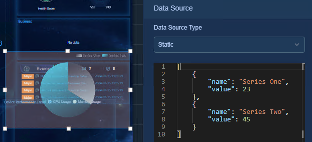
6. Click Configure in the Data Source area to open the data source configuration panel. Select Static for Data Source Type.
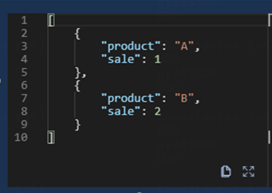
7. View the static data source structure of the widget, as shown in Figure 18. Edit the values in the static data source and verify the relationship between the parameters and the chart. For example, a static data source is an array where each element represents the proportion of a series in a pie chart. The name property corresponds to the series name, and the value property corresponds the series value used to calculate the proportion for the chart.
Figure 18 Verifying the relationship between the chart and static data
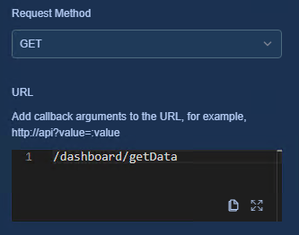
8. After understanding the relationship between the chart and static data, you can start binding an API data source. Select API for Data Source Type and GET for Request Method. Use the built-in GET testing interface of the custom dashboard for testing. Enter URL /dashboard/getData, as shown in Figure 19.
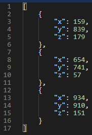
9. The interface returns an array, with each element having three properties: x, y, and z. Each property has a randomly generated integer value, as shown in Figure 20.
Figure 20 Data returned by the interface
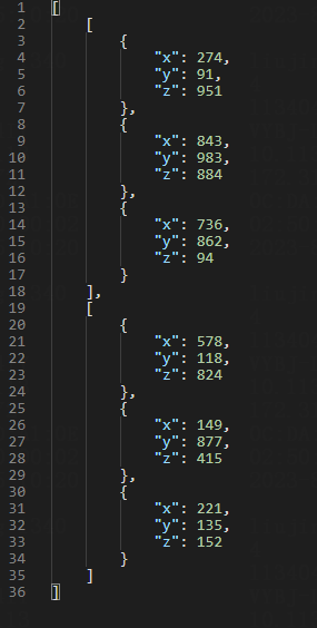
10. Configure multiple data sources. For example, add another data source, select the GET request, and request the interface data again. The data source will combine the results returned from both interfaces into a single array containing two elements, as shown in Figure 21.
Figure 21 Data array returned by the interfaces
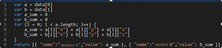
11. For the single data source requested in step 8 and the two data sources requested in step 10, the returned data structure does not match the static data format. In this case, the chart cannot render data correctly. To resolve this issue, use a data filter to further process the returned result. For example, assume two requests to /dashboard/getData are for monthly sales quantities of products x, y, and z from vendors A and B in the first quarter. To create a pie chart comparing the total sales of both vendors in the first quarter, you can process the data by using a JavaScript script, as shown in Figure 22.
Figure 22 Drawing a proportion pie chart
12. After saving the data filter, you can see that the pie chart can renders data correctly. Because the API in this example returns randomly generated values, the result might differ from the legend.
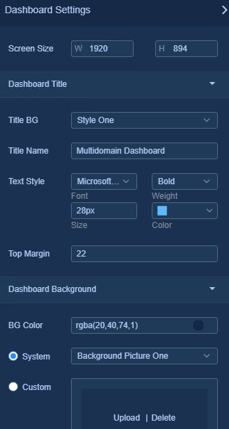
Page settings
Screen size
In page settings, you can customize the canvas width and height, with the default being 1920 × 1080. As a best practice, configure this setting based on your display resolution.
1. Click the Page Settings icon  to
open the page settings panel.
to
open the page settings panel.
2. Enter the width and height values, as shown in Figure 23.
Figure 23 Screen size settings
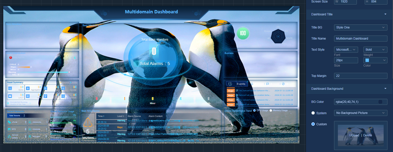
Dashboard background
Background color
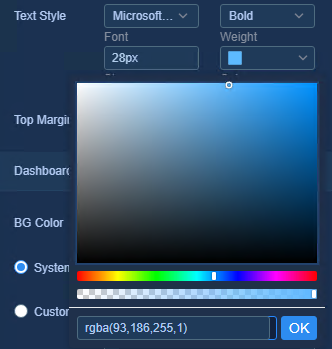
The default background color is RGBA(20,40,74,1). You can click to select a background color or enter a color code to change it, and adjust transparency as shown in Figure 24.
Figure 24 Background color settings
Background image
By default, the dashboard has no background image. The system provides multiple background image options and supports uploading custom background images, as shown in Figure 25 and Figure 26.
Figure 25 System background image settings
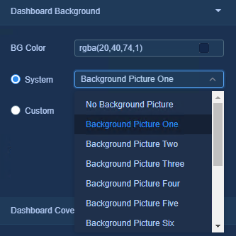
Figure 26 Custom background image settings
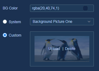
To customize the background image:
1. Click to select the canvas.
2. Select the Custom option in the dashboard background section of the page settings panel.
3. Click the upload link and select an image to upload.
4. After the image is successfully uploaded, you can preview the effect directly on the canvas, as shown in Figure 27.
Figure 27 Previewing the image
Dashboard cover
The dashboard displays a default cover image on the home page card, as shown in Figure 28. You can customize the dashboard cover image.
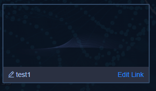
To customize a cover:
1. Click to select the canvas.
2. In dashboard cover section of the page settings panel, click the cover image upload link and select an image to upload.
3. After the image is successfully uploaded,
click the Save icon  to save the settings.
4. Click the Dashboard Editor icon  ,
return to the homepage, and view the cover, as shown in Figure 29.
,
return to the homepage, and view the cover, as shown in Figure 29.
Figure 29 Change the cover image
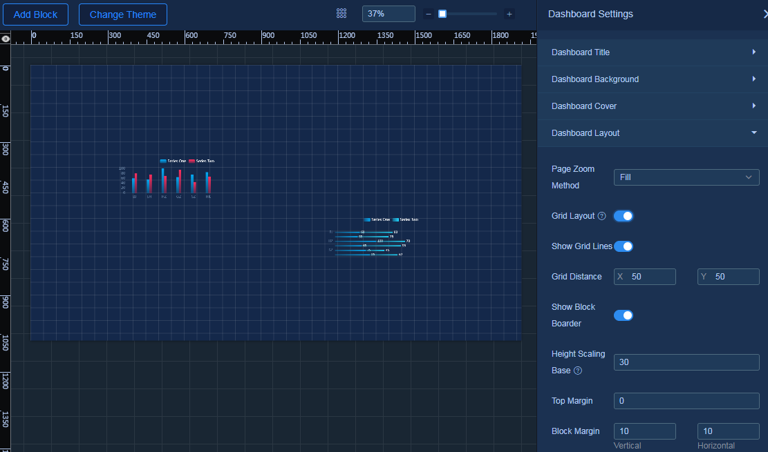
Dashboard layout
Page zoom method
By default, the full screen mode applies. The system supports selecting proportional height fill, proportional width fill, and autosensing zoom.
Grid layout
You can enable grid layout for dashboard editing.
1. Click to select the canvas.
2. Select Page Settings > Dashboard Layout, and turn on the Grid Layout option.
3. Turn on the Show Grid Lines option (optional).
4. Set the grid distance. After you set the grid distance, dragging a component on the canvas will display multiples of the values for their horizontal and vertical coordinates, as shown in Figure 30.
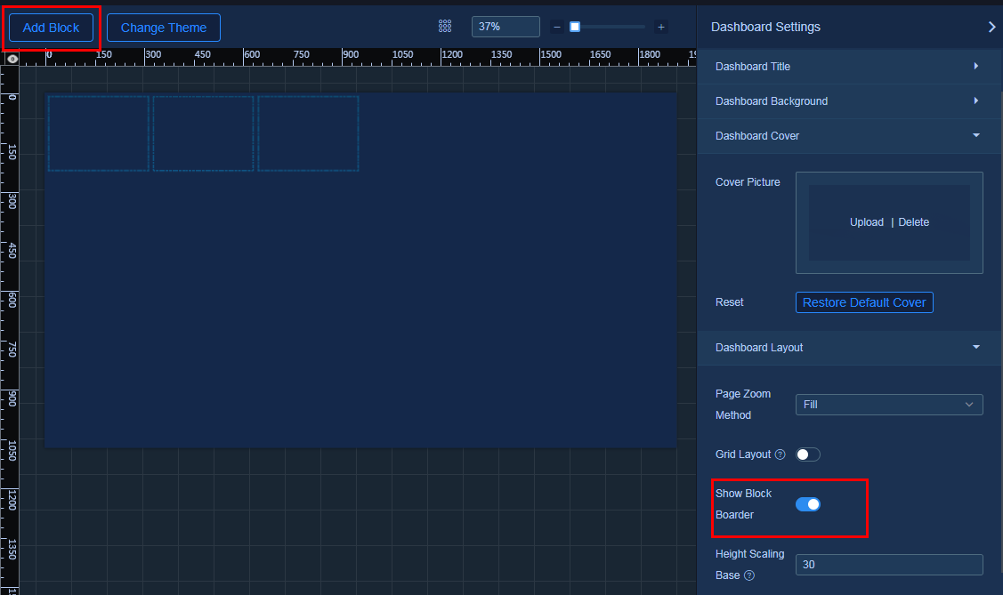
Block layout
Use block layout for quick arrangement of the dashboard. First, add a block to the dashboard for layout positioning, then add a component to the block. The component will automatically zoom and fill the entire block, reducing the workload for adjusting the component position.
|
|
NOTE: · A block can only be filled with one component, and it can be covered by layers outside the block. · You cannot drag generated layers into a block. You can use the favorites feature to save the configuration and use the components in favorites to fill the block. · Block layout is less accurate than free layout. |
1. Select Page Settings > Dashboard Layout, and turn on the Show Block Boarder option.
2. Click Add Block above the canvas. You add a new block each time upon each click on the button, as shown in Figure 31.
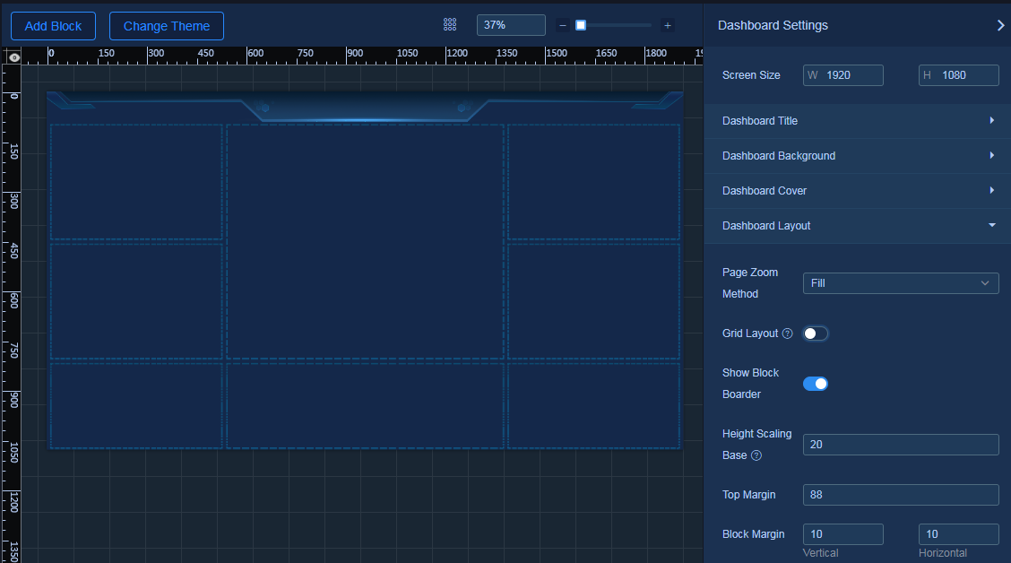
3. Configure block parameters.
¡ Height Scaling Base: The base value for each component change in height.
¡ Top Margin: The space between the topmost block and the canvas margin.
¡ Block Margin: The vertical and horizontal space between blocks.
4. Arrange the block position and select the dashboard title style, as shown in Figure 32.
Figure 32 Arranging the block position
5. Fill components to the block, and set parameters such as dashboard title, as shown in Figure 33.
Figure 33 Filling components to the block
Data configuration
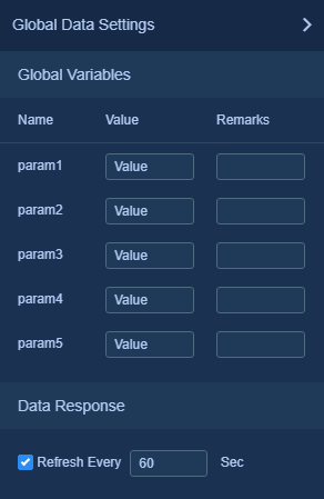
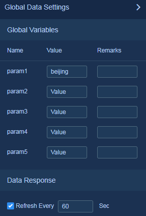
Define default values for global variables in the global data settings to dynamically control API request parameters in Widget through paths, transfer the obtained parameters to Widget, and display data through Widget. Each dashboard supports setting default values for a maximum of five global variables.
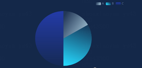
This example shows how to create a dashboard for displaying the sales proportion of products (A, B, C) across different regions. In this example, configure the API to obtain sales data for a region. The API contains a key parameter. You can enter the region name to obtain returned sales data for that region. The data source contains data from regions such as Beijing and Shanghai.
1. For information about the procedure to create a dashboard, see "Creating a dashboard." When creating a dashboard, configure the custom URL as productsale, as shown in Figure 34.
Figure 34 Creating a dashboard
2. On the dashboard settings page, select the basic pie chart to display data and configure the style and data source for the pie chart.
a. Click the Widgets icon  to
open the widget list.
to
open the widget list.
b. On the Chart&Table Widgets tab, drag and drop the Basic Pie widget onto the canvas.
c. Click the Page Settings icon  to
open the page settings panel.
to
open the page settings panel.
d. Click a widget on the canvas to switch to the tile settings panel.
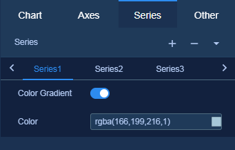
- In the style configuration panel  , click the Series
tab. Based on number of products to be displayed, click the
, click the Series
tab. Based on number of products to be displayed, click the  icon
to add series and configure their colors, as shown in Figure 35.
icon
to add series and configure their colors, as shown in Figure 35.
- In the style configuration panel  , expand the Title
Settings area, turn on the Show Title option, and change the component title to
Sales Proportion.
, expand the Title
Settings area, turn on the Show Title option, and change the component title to
Sales Proportion.
e. Click the Data icon  to
switch to the data settings panel.
to
switch to the data settings panel.
f. Click Configure in the Data Source area to open the data source configuration panel. Select API for Data Source Type, and select GET for Request Method. Enter a key parameter and specify the value of global parameter param1 by using a colon, as shown in Figure 36.
Figure 36 Configuring the data source type and request method
|
|
NOTE: Use this interface for temporary internal testing. When using it in actual situations, enter the API that exists. |
g. Click the Global Data Settings icon  to
open the global data configuration panel.
to
open the global data configuration panel.
h. Define the default values for the global variables, as shown in Figure 37. For example, define the value for param1 as beijing.
Figure 37 Editing the variable values
i. View the data response result for the layer access API, as shown in Figure 38.
Figure 38 Data response result
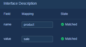
j. View the states between fields and mappings, as shown in Figure 39.
Figure 39 Successful field match
3. Click  to save the
dashboard. Access the dashboard through the URL. For how to obtain the
dashboard URL, see "Specify a dashboard."
to save the
dashboard. Access the dashboard through the URL. For how to obtain the
dashboard URL, see "Specify a dashboard."
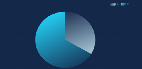
a. If you use the URL without the param1 parameter to access the dashboard, the pie chart displays Beijing data by default, as shown in Figure 40.
Figure 40 Pie chart without the param1 parameter

b. If you use the URL with the param1 parameter and parameter value beijing to access the dashboard, the result is shown in Figure 41.
Figure 41 Pie chart with the param1 parameter
c. If you use the URL with the param1 parameter and parameter value shanghai to access the dashboard, the result is as shown in Figure 42.
Figure 42 Pie chat with the param1 parameter and parameter value shanghai
Map component
The map component is more complex than other components, so it is described separately in this section.
Style settings
Like other components, the map has both basic and custom styles. Basic style configuration typically includes size, location, transparency, background, title, and margin settings.
Basic style
1. Click the Page Settings icon  to
open the page settings panel.
to
open the page settings panel.
2. Click the Map Widgets tab, then drag and drop the component to the canvas.
3. Click the map component on the canvas, and the panel will automatically switch to the component settings panel, as shown in Figure 43.
Figure 43 Style configuration - basic style
Custom style
Map style customization includes global settings, area layer, bubble layer, line layer, and tooltips.
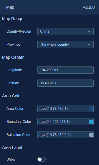
Global settings
Configure the overall display content and effects of the map, including the initial display range of the map, the position within the layer area, the size of the map within the layer, and the display effects of various areas on the map.
1. In the component settings panel, select the Global Settings tab, as shown in 2.Figure 44. This example takes configuration of the China - National Map for illustration.
2. Configure the following parameters:
¡ Map Range: Set the country to be displayed by the map. Options include World, China, and various countries. The China map supports displaying the province, city, and district/county levels.
¡ Map Center: After switching maps, the system automatically displays the latitude and longitude data of the map center.
¡ Area Color: Set the area color, area boundary color, and the color when you hover over an area.
¡ Area Label: When area label is enabled, the system automatically displays the name of each area. The system supports setting the text style for the areal label.
¡ Map Zoom: Adjust the map scale to focus on the desired zone.
Area layer settings
Use this feature to configure the style of each area on the map. This section takes a China national map as an example, where the largest administrative division in China is the province. You can set the area style for each province as shown in Figure 45 and Figure 46.

Figure 46 Area layer configuration effects
Bubble layer settings
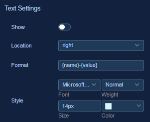
Customize the style and effect of the light dots on the map.
Figure 47 Bubble layer
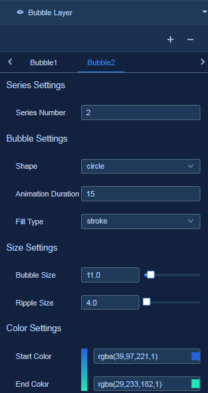
Figure 48 Bubble layer text settings
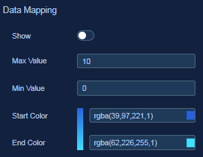
After you enable data mapping for the bubble layer, if the source data matches the maximum and minimum value changes in the data mapping settings, the bubble color will change accordingly.
Figure 49 Bubble layer data mapping
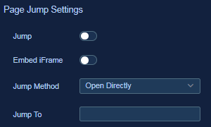
For page jump settings for the line layer and bubble layer, see "Page jump settings."
Figure 50 Bubble layer page jump settings
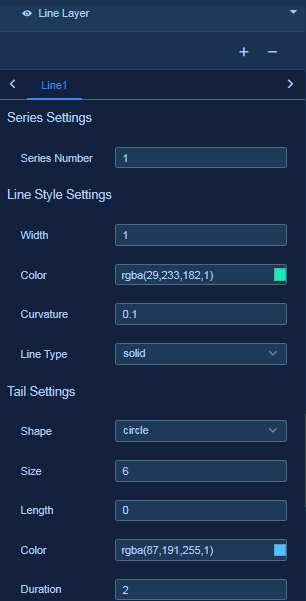
Line layer settings
Configure custom connection styles between bubbles.
Figure 51 Link style settings
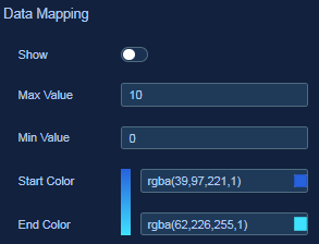
After you enable data mapping for the line layer, if the obtained source data matches the maximum and minimum value changes in the data mapping settings, the line color will change accordingly.
Figure 52 Line layer data mapping
For page jump settings for the line layer and bubble layer, see "Page jump settings."
Figure 53 Line layer page jump settings

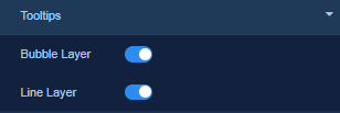
Tooltips
Specify whether to display tooltips when hovering over the bubble layer or line layer on the dashboard, as shown in Figure 54.
Page jump settings
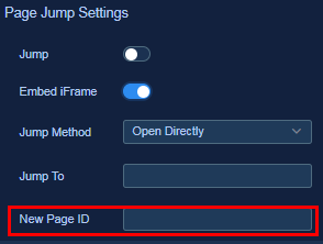
You can configure page jump settings for the bubble or line layer to enable page jumping upon clicking on a bubble or a line.
Page jump methods include Open Directly, Open in New Window, and Open in Popup Window.
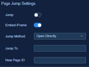
The Embed iFrame option in the page jump settings is used specifically for page jumps between menus within the system environment. This section takes Unified Platform as an example. When a dashboard is specified as iFrame for a Unified Platform page, a click on a bubble or line on the dashboard requires jumping to a specific menu of Unified Platform. If you turn on this option, you need to specify the New Page ID parameter, as shown in Figure 56.
Figure 56 Configuring a new page ID
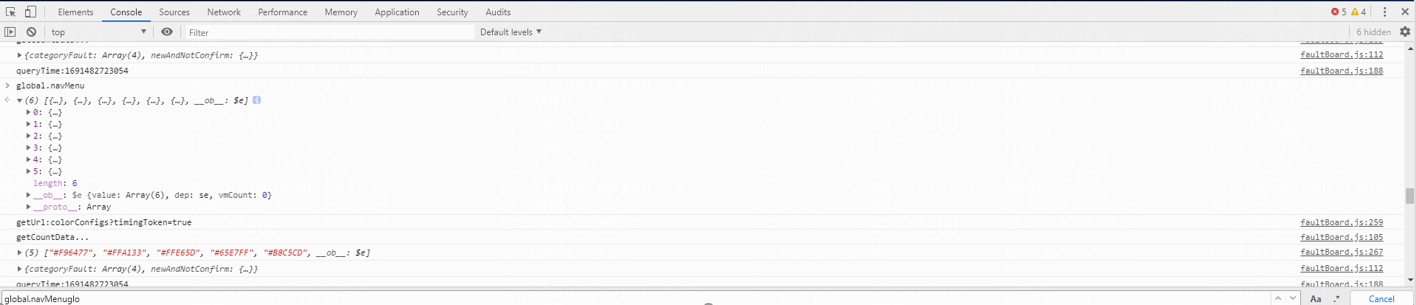
This section takes page jump to the monitoring page by clicking a bubble as an example to illustrate how to obtain and use the new page ID.
1. Log in to Unified Platform and press F12 to open the developer tools. Open the Console tool and enter global.navMenu, as shown in Figure 57.
Figure 57 Opening developer tools
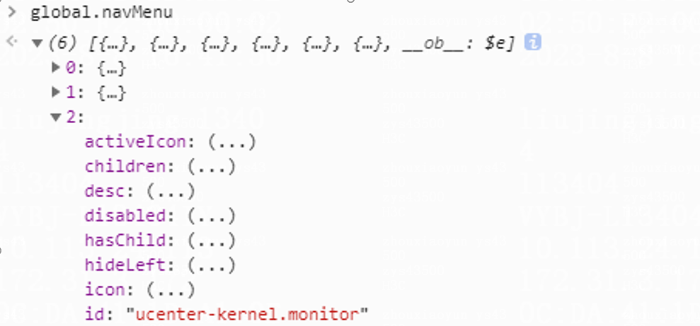
2. Locate the id property on the monitoring page. The ucenter-kernel.monitor value is the new page ID, as shown in Figure 58.
Figure 58 Locating the page ID
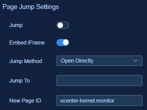
3. Enter the dashboard page to be edited (for detailed steps, see "Editing a dashboard"). On the component settings panel, turn on the Embed iFrame option in the page jump settings for the bubble layer, and set ucenter-kernel.monitor as the new page ID, as shown in Figure 59. If you enable both page jump and iFrame embedding, iFrame embedding takes precedence.
Figure 59 Configuring internal menu page jump
4. Click  to save the
dashboard.
to save the
dashboard.
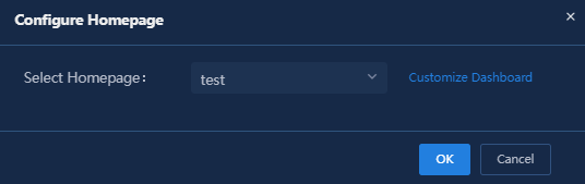
5. Quit the dashboard editor page, click the Settings icon at the top right of the page, and select Configure Homepage. Set this dashboard as the homepage in the pop-up window, and then re-log in to the system. Then you can click the bubble on the dashboard to go to the monitoring page.
Figure 60 Homepage configuration-1
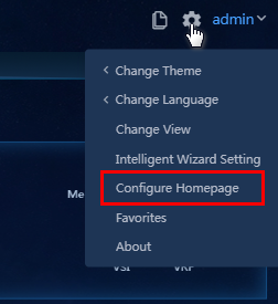
Figure 61 Homepage configuration-2
Data source usage
Data sources of the map contain bubble layer, line layer, bubble tooltips, and line tooltips. The data source settings of each layer are independent to each other.
Data source in page jump settings
If the data returned by the data source at each level matches the format, its properties can be specified for page jump settings in the style configuration.
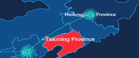
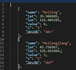
This section takes the bubble configuration of Beijing and Heilongjiang in the map component as an example.
1. On the component settings panel of the map
component, click  to switch to the data configuration panel.
2. Select the bubble layer tab, and then click Configure in the Data Source area to open the data source configuration panel. Select Static for Data Source Type to configure the static data source, as shown in Figure 62.
Figure 62 Configure data for two bubble points
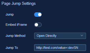
3. Click  to switch to the
configuration panel. Select the bubble layer and configure the page jump
settings, as shown in Figure 63.
to switch to the
configuration panel. Select the bubble layer and configure the page jump
settings, as shown in Figure 63.
¡ Page Jump Method: Options are Open Directly, Open in New Window, and Open in Popup Window. This section takes the Open in New Window method as an example.
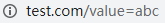
¡ Configure the redirect URL as http://test.com and specify the devSN attribute from the static data source as the parameter value by using a colon.
4. Click  to save the
dashboard. Click
to save the
dashboard. Click  to preview the configured dashboard. You can click the bubbles for
Beijing and Heilongjiang in the map to view redirect URLs as shown in Figure 64 and
Figure 65.
to preview the configured dashboard. You can click the bubbles for
Beijing and Heilongjiang in the map to view redirect URLs as shown in Figure 64 and
Figure 65.
Figure 64 Redirect URL for Beijing
Figure 65 Redirect URL for Heilongjiang
Use data source for interaction configuration
The map-specific interaction configuration allows for passing data from the bubble and line layers into a variable. This variable can be used by other data layers of the map component or the APIs in the data source of other components.
This section takes the bubble configuration of Beijing and Heilongjiang in the map component as an example.
1. On the component settings panel of the map
component, click  to switch to the data configuration panel.
2. Select Bubble Layer, and then click Configure Data Source to access the data source configuration pane. Select Static for Data Source Type to configure the static data source, as shown in Figure 66.
Figure 66 Configuring data for two bubble points

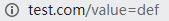
3. Click  to switch to the
interaction configuration panel. Select the Interaction tab of the bubble
layer, enable hover incidents, and bind the name field to variable test, as
shown in Figure 67.
to switch to the
interaction configuration panel. Select the Interaction tab of the bubble
layer, enable hover incidents, and bind the name field to variable test, as
shown in Figure 67.
Figure 67 Interaction settings
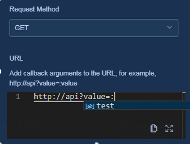
4. Add a basic bar chart component. For more information about the operation, see section "Add Block."
5. Set the component data to API data with the request method as GET. For more information about the operation, see "Data settingsAPI data." Configure URL http://api?value=:test. When you enter a colon, the available interaction variable will be displayed as shown in Figure 68.
Figure 68 Component data settings
6. Click  to save the
dashboard. Click
to save the
dashboard. Click  . When you hover over the Beijing bubble, the test value will be
replaced with the name of the bubble.
. When you hover over the Beijing bubble, the test value will be
replaced with the name of the bubble.
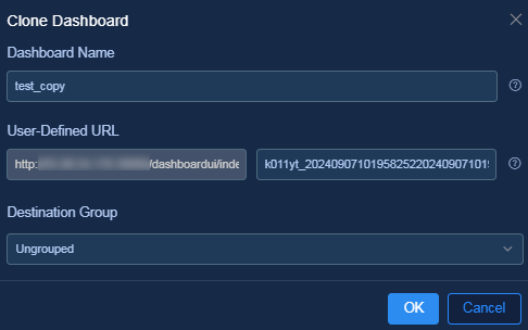
Clone a dashboard
Cloning an existing dashboard will create a new dashboard with the same settings as the existing dashboard.
1. Select a dashboard and click  on the
dashboard card.
on the
dashboard card.
2. On the window that opens, edit the dashboard name, URL relative path, and group, as shown in Figure 69. To successfully save the newly cloned dashboard, edit the relative path in the URL. If you do not perform this operation, a message will be displayed that the dashboard path already exists, and the clone operation will fail.
Figure 69 Dashboard cloning settings
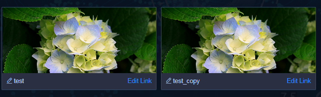
3. Click OK. The cloned dashboard and original dashboard are as shown in Figure 70.
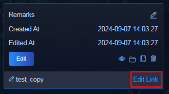
Specify a dashboard
Obtain the dashboard URL, and then use it to access the dashboard through a browser or embed it in the iFrame component.
1. Access the Dashboard Editor page.
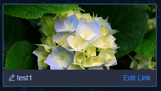
2. Select the target dashboard and click Edit Link on the dashboard card, as shown in Figure 71.
3. On the dashboard URL editing window that
opens, click  to copy the complete link, as shown in Figure 72.
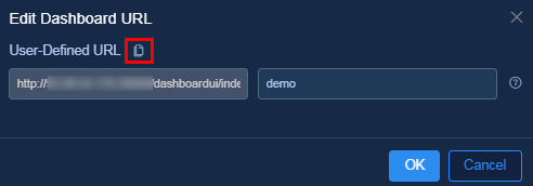
4. You can use the copied link to directly access the dashboard through a browser as shown in Figure 73, or embed it into iFrame.
Figure 73 Accessing the dashboard
Carousel display
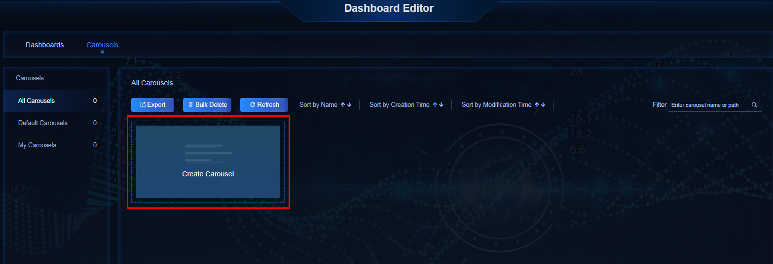
This section describes how to create a standard carousel display. Carousel display allows you to select up to five created dashboards and display them in a carousel way.
1. Navigate to the Dashboard Editor > Dashboard List > All Dashboards page. You can preview the contents and effects of existing dashboards, or create multiple new dashboards.
2. Navigate to the Carousel Dashboard List > All Carousel Dashboards to enter the all carousel dashboards page, as shown in Figure 74. Click the Create Carousel Dashboard link.
Figure 74 Creating a carousel dashboard display
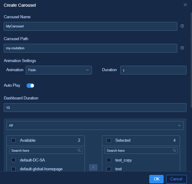
3. Configure the following carousel settings, as shown in Figure 75.
¡ Carousel Dashboard Name: Enter the name of the carousel dashboard.
¡ Carousel Dashboard Path: Specify the unique access path for the dashboard, which cannot be duplicated.
¡ Animation Effects: Specify the dashboard transition animations, which is the duration of transition animations.
¡ Auto Play: You can specify carousel display upon mouse click or auto play of dashboards. To specify the auto play method, you need to set the duration for each dashboard to stay.
¡ Select dashboards: You can add a maximum of five common dashboards to the carousel queue.
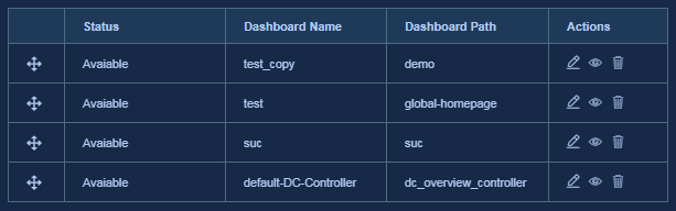
4. You can drag and drop the dashboard table to adjust the carousel order of the dashboards, as shown in Figure 76.
Figure 76 Adjusting the carousel order for the dashboards
5. Click OK to complete the creation of the carousel display, as shown in Figure 77.
Figure 77 Created carousel display
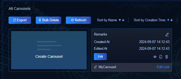
6. To view the created carousel display, click Edit Link on the card, copy the custom dashboard URL, paste it into your browser, and then refresh the page.
iFrame component
The dashboard offers an iFrame component to nest other pages.
1. Click the Widgets icon  to
open the widget list.
to
open the widget list.
2. Select the Auxiliary Components tab on the left of the component list, and then select the iFrame component, as shown in Figure 78.
Figure 78 Selecting the iFrame component
3. Configure the URL for the nested page in component settings. You can use the default protocol HTTP, and you must enter the complete domain name. If the protocol, IP, port, and the address of the URL are the same as those of the dashboard, you only need to enter the path portion.